Rebranding and illustration new style creating
Wirestock is a platform that helps photographers, videographers, and illustrators monetize their work by distributing content to stock marketplaces and licensing it for AI training. For their rebranding, we refreshed their logo to reflect a modern and approachable identity and created custom illustrations that bring their platform to life. The new visual style emphasizes creativity, accessibility, and a user-friendly experience, giving Wirestock a cohesive and engaging brand presence
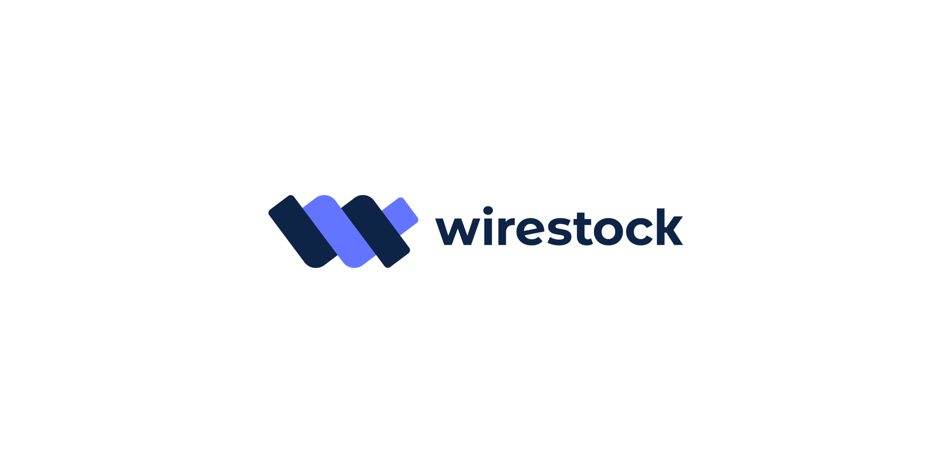
Logo soft gradient version for light & dark modes use.
The soft-gradient Wirestock logo features two intertwined ribbon-like “wires” forming a dynamic “W,” with a smooth transition from blue to violet. This design adds depth, movement, and a sense of connectivity, symbolizing how the platform links creators with marketplaces. The clean, geometric shapes ensure clarity and recognizability, while the gradient gives a modern, digital-friendly, and energetic feel that reflects Wirestock’s mission.
Illustrations
The illustrations are created in a minimalist flat style, featuring bright neon gradients and clean geometric shapes.
Dynamic poses and bold perspective play convey energy, a modern spirit, and the technological nature of the Wirestock brand.
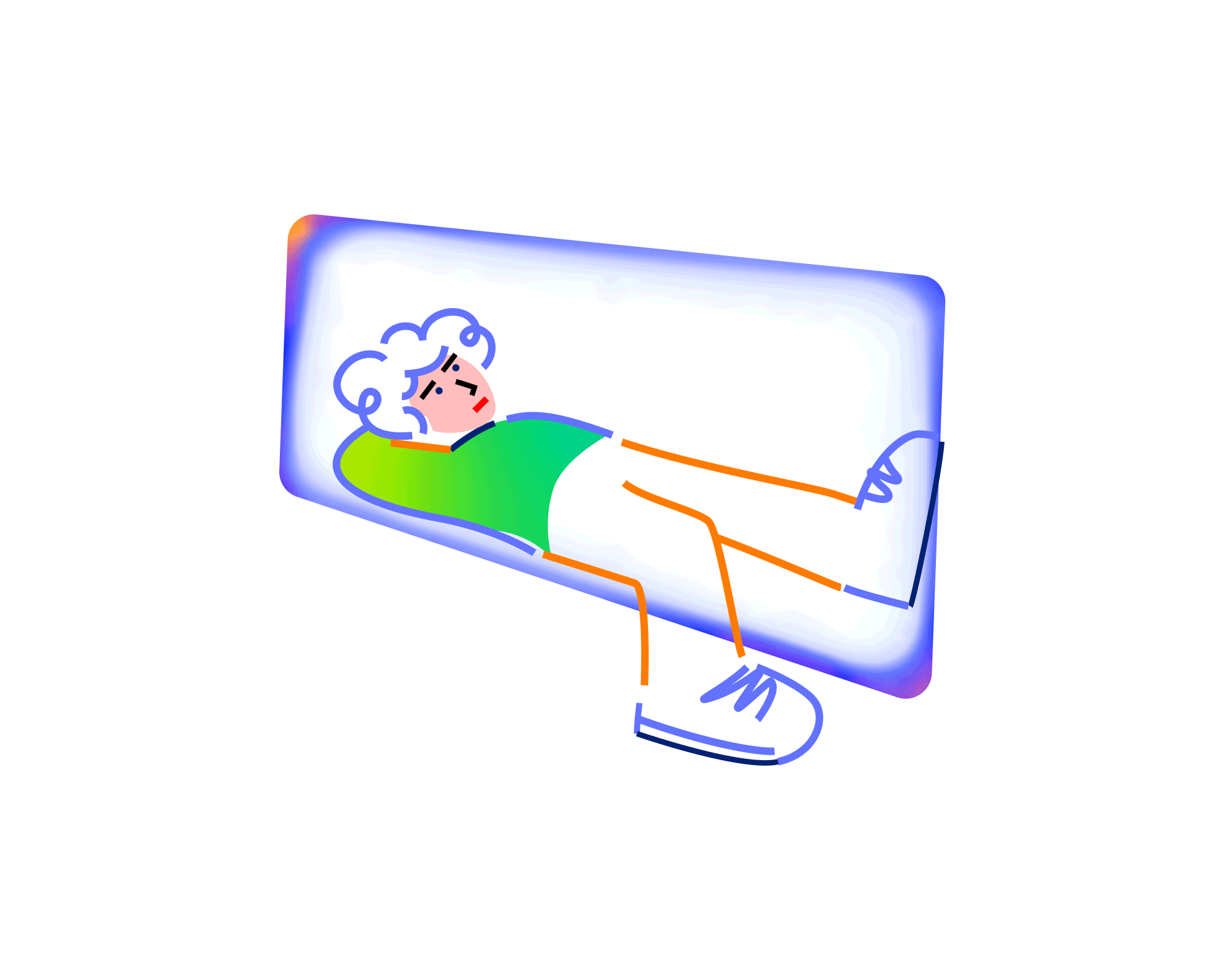
The character is represented in two modes: Light and Dark.
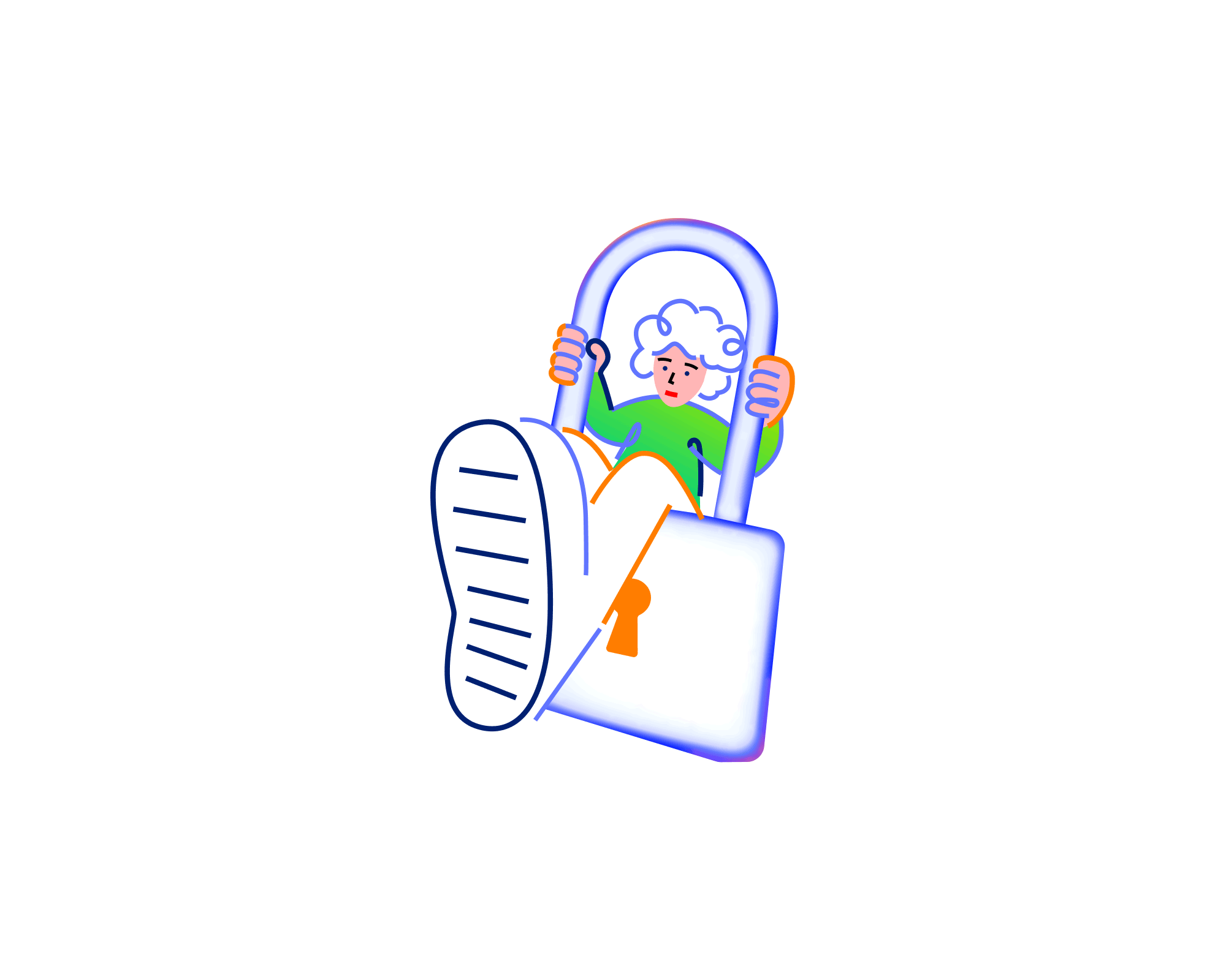
Don't have permission
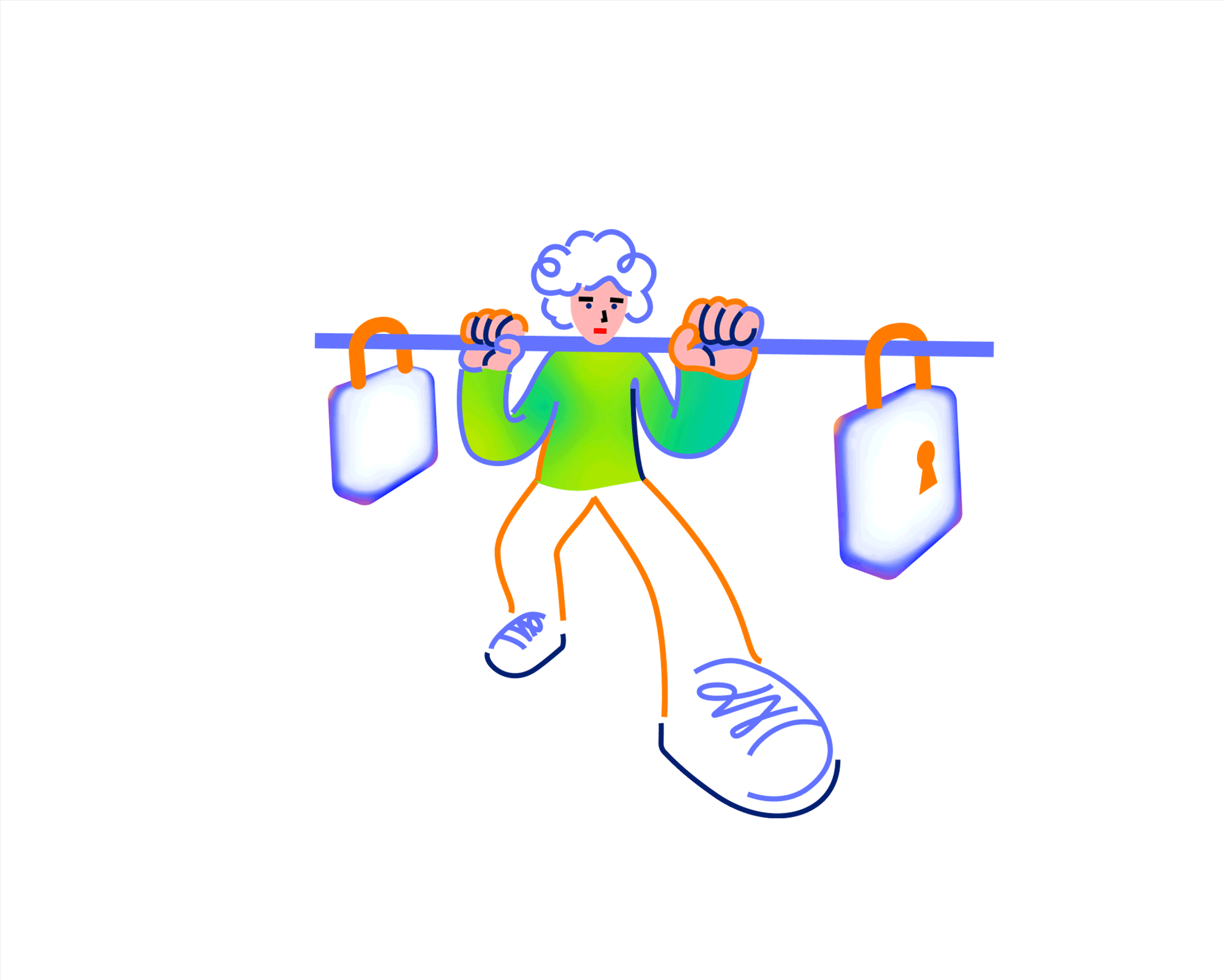
The illustration uses a playful, minimal style with soft gradients and clean vector lines.
The exaggerated perspective — with the large foot in the foreground — creates a sense of depth and motion.
Bright colors and rounded shapes make the image feel friendly, even while conveying the idea of restriction or limited access.
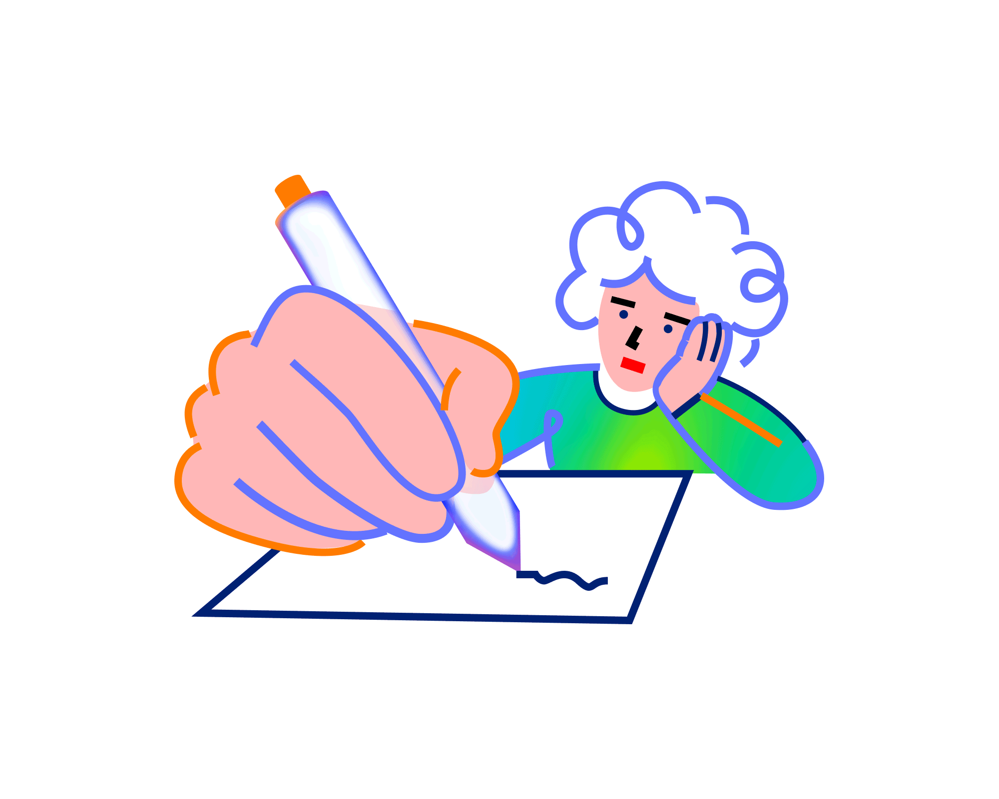
No submission
A stylized illustration representing the moment of doubt before submission.
The use of gradient color and dynamic perspective draws focus to the act of creation itself.
Minimal details and bold contrasts make the message visually clear and emotionally relatable.
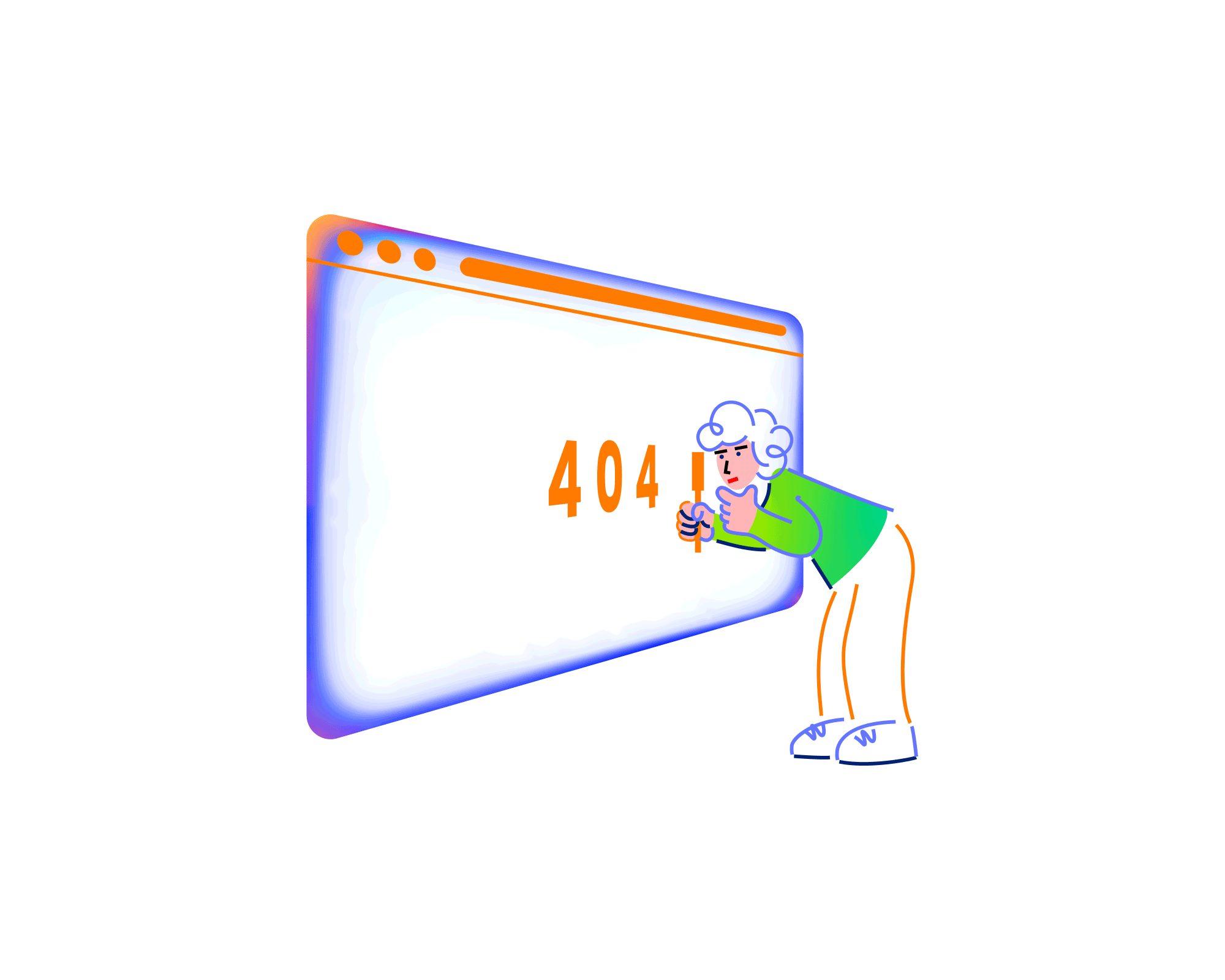
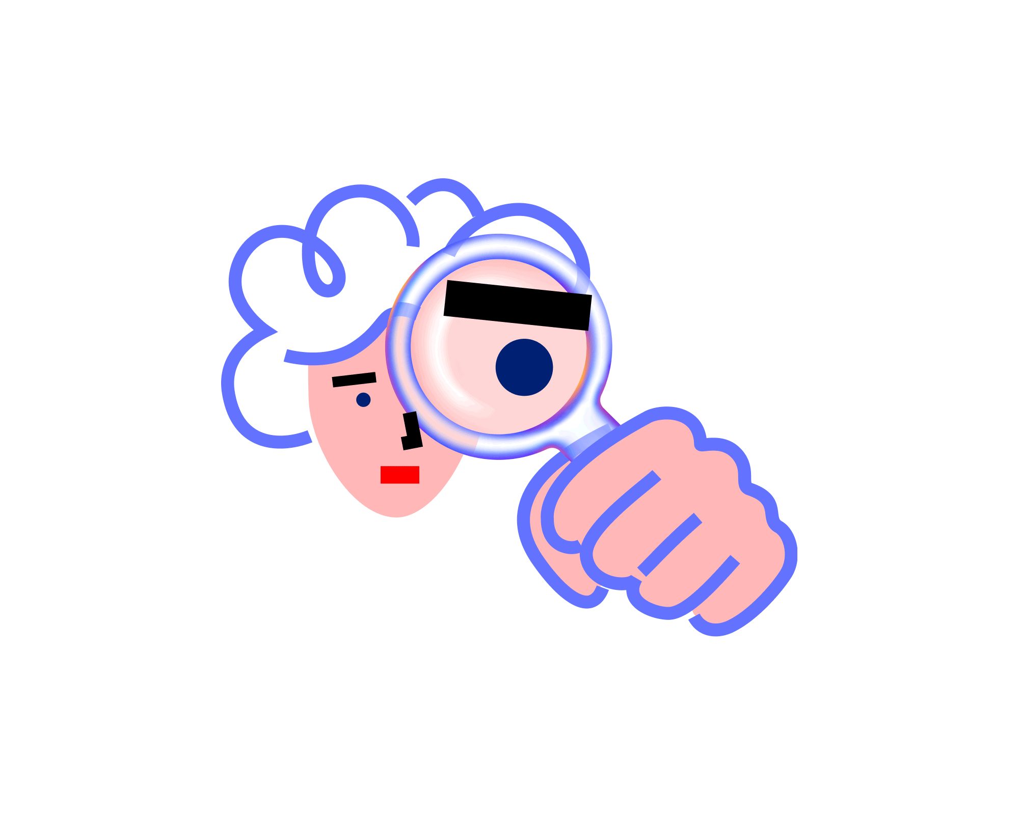
Error 404
The illustration captures the familiar frustration of facing an error online.
The character’s curious yet confused expression mirrors the user’s reaction to a broken link or missing page.
No projects
A conceptual illustration for a “No Projects” page.
The composition uses symmetry and gradient color to express calmness and creative waiting.
It turns an empty state into a visually engaging and emotionally relatable experience.
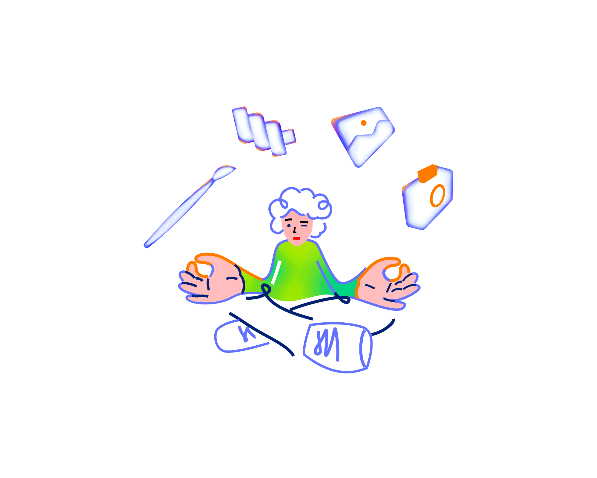
No results
This artwork visualizes the “No results” as a human interaction — a moment of searching and checking.
The glowing frame and vibrant tones highlight the digital nature of the issue.
The overall style aligns with the project’s visual identity, ensuring consistency and clarity across different interface states.
No permission
ChatGPT said:
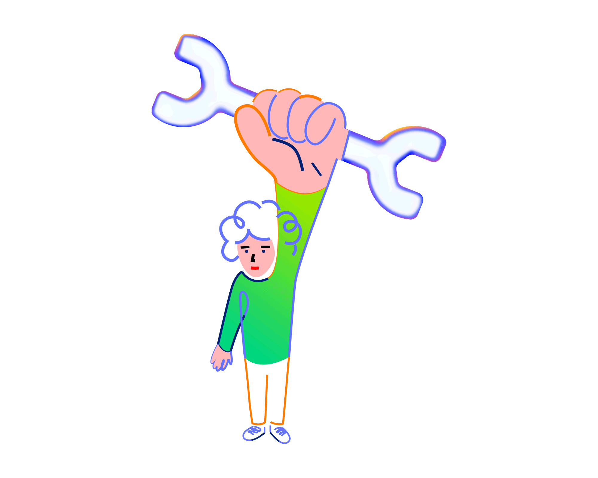
Unexpected error
A vibrant illustration created for an “Unexpected Error” page.
The character’s surprised expression and dynamic composition capture the sudden, unpredictable nature of the moment.
Bold gradients and geometric shapes bring energy and movement to the scene, transforming confusion into visual interest.
The playful yet structured style keeps the message approachable while maintaining consistency with the overall design system.
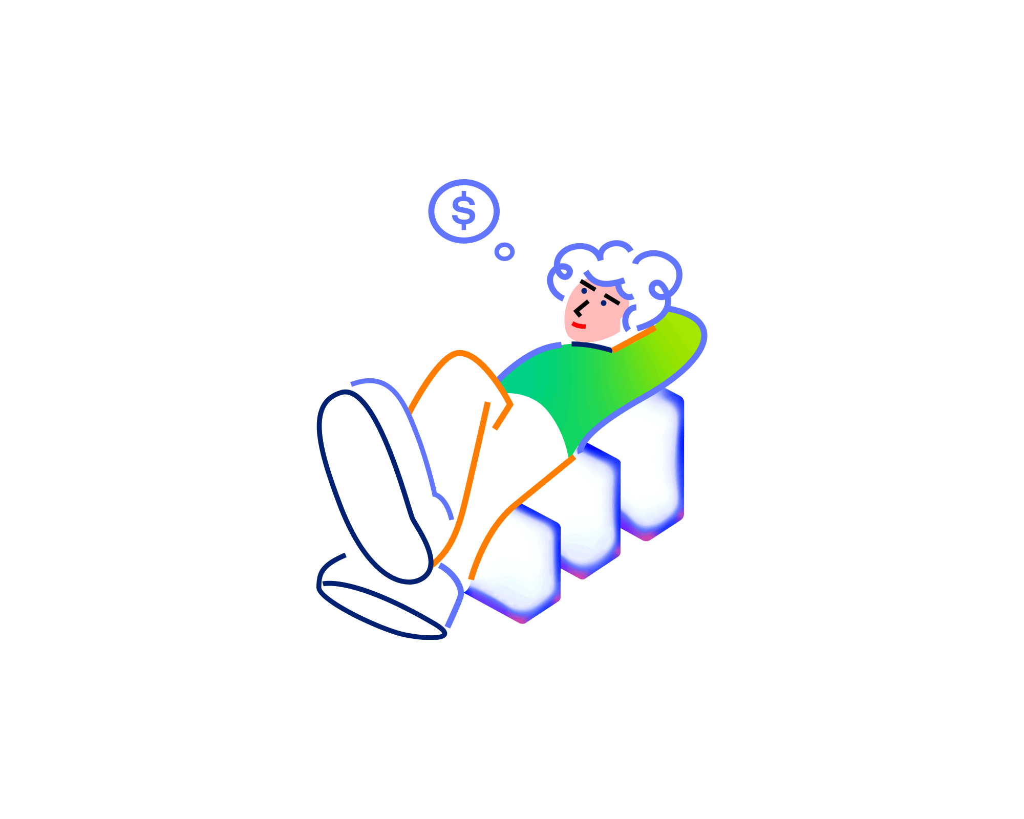
Empty dashboard
A clean and minimal illustration designed for an “Empty Dashboard” state.
The relaxed posture of the character conveys calmness and readiness for upcoming activity.
Soft gradients and balanced composition create a sense of space and simplicity, emphasizing focus and potential.
The friendly, modern aesthetic turns an empty interface into a welcoming starting point for the user.
No schemes
ChatGPT said:
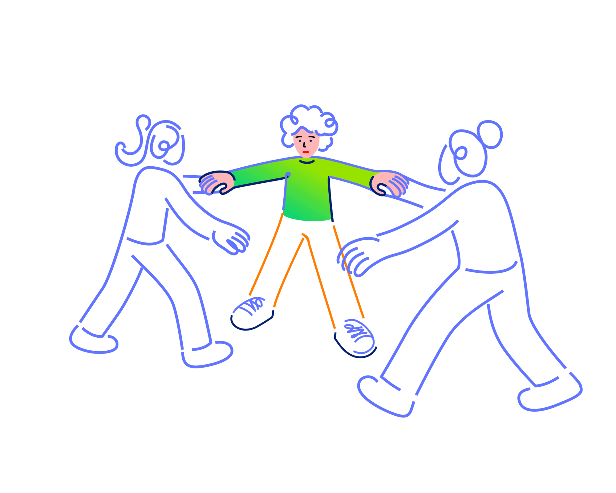
No group
A conceptual illustration for a “No group” page.
The composition uses characters and gradient color to express calmness and creative waiting.
It turns an empty state into a visually engaging and emotionally relatable experience.
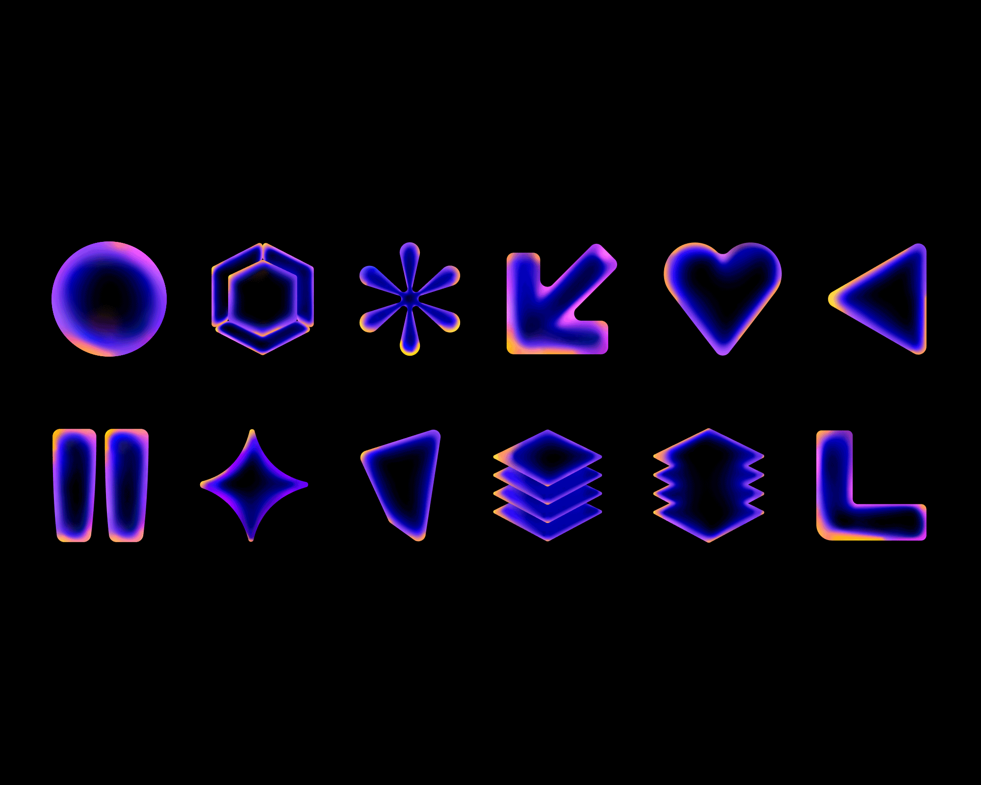
Shapes
Within the brand’s visual identity, there are specially designed shapes that reflect the brand’s style.
They can be freely used both on digital platforms and in printed materials, while maintaining the brand’s color and structural principles.
Just like the brand’s illustrations, the shapes are used in two versions — light and dark modes — depending on the background color and the environment of use
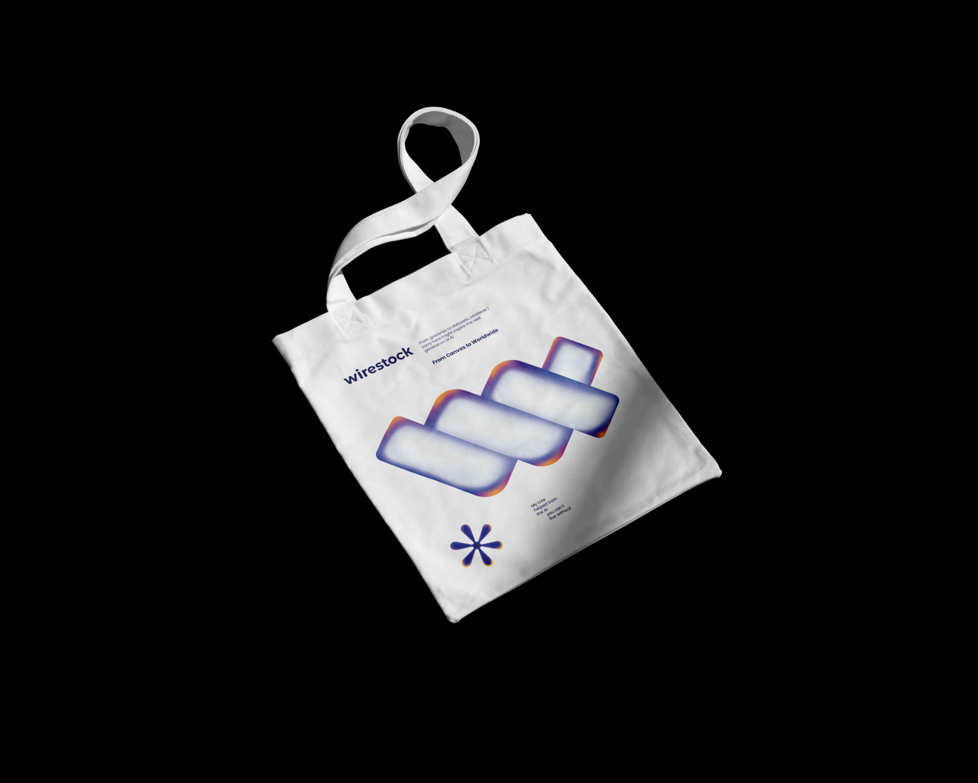
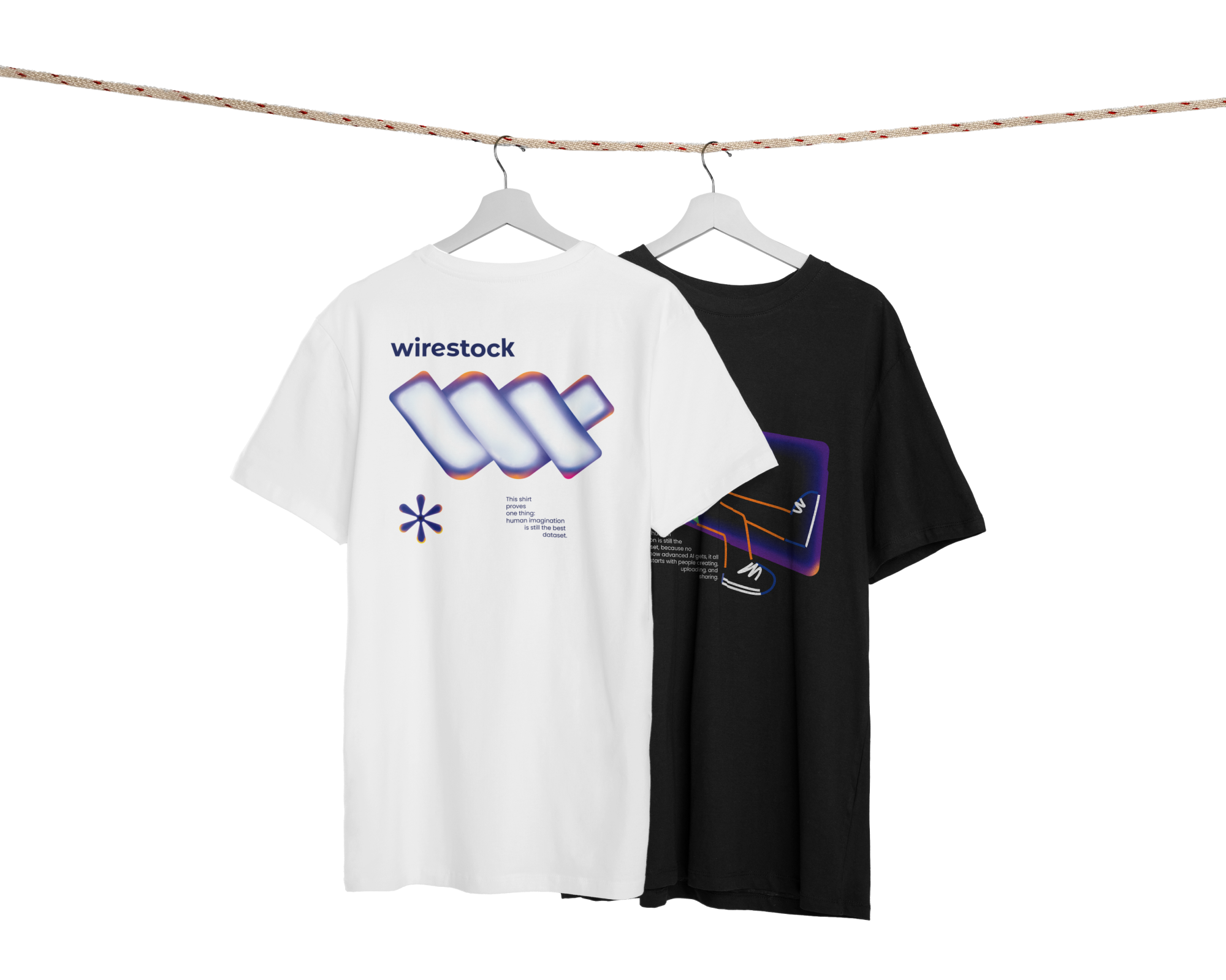
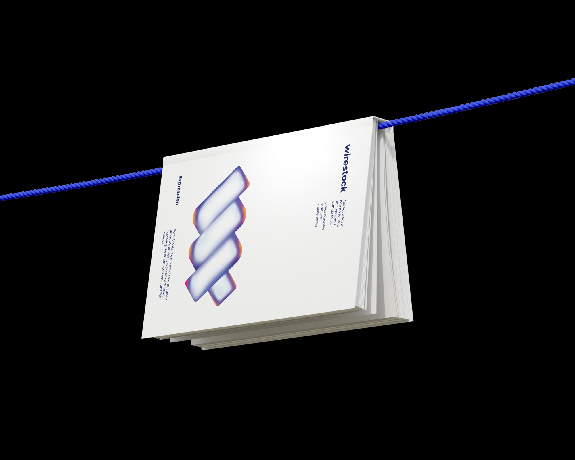
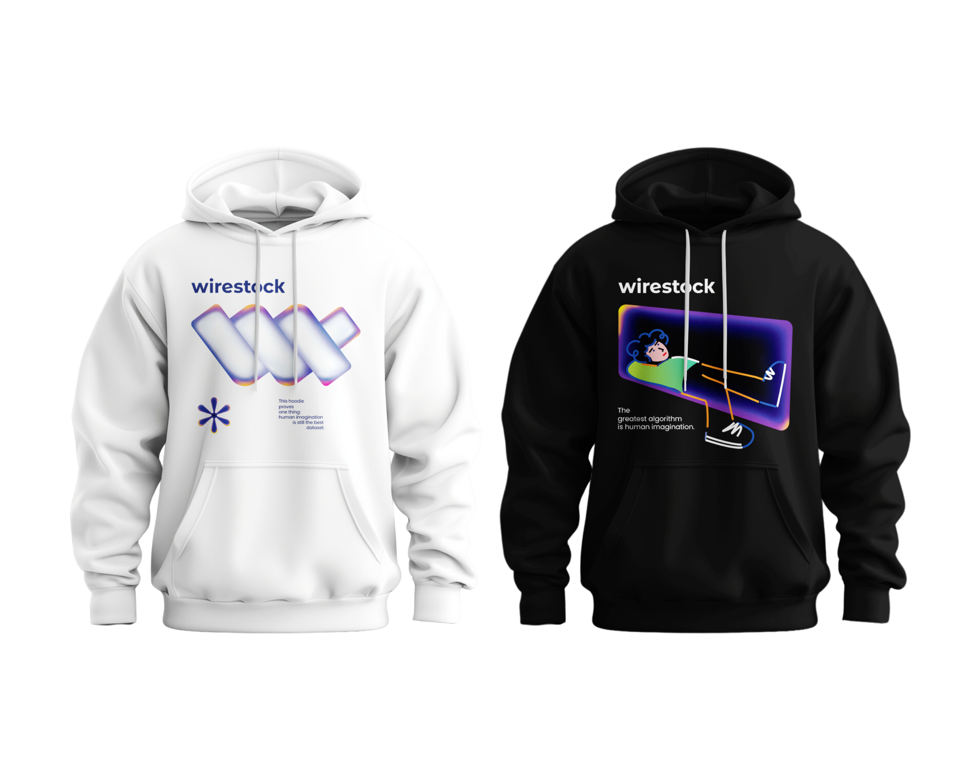
Print Elements
A collection of original print designs created for different mediums — clothing, accessories, and stationery.
Each element is crafted with attention to texture, balance, and visual harmony.
The prints are easily adaptable to hoodies, shoppers, and sketchbooks.
They represent a unified visual language for various printed materials.