Bella Roma
Bella Roma Location: USA Service։ branding
Bella Roma is a pizza and pasta restaurant whose rebranding aimed to rejuvenate its image and reflect the changes taking place within the business.
One of the key objectives of the rebranding was to create a more modern and expressive visual identity while preserving the brand’s core values: fresh pasta and pizza dough made by hand on-site, as well as consistent quality.
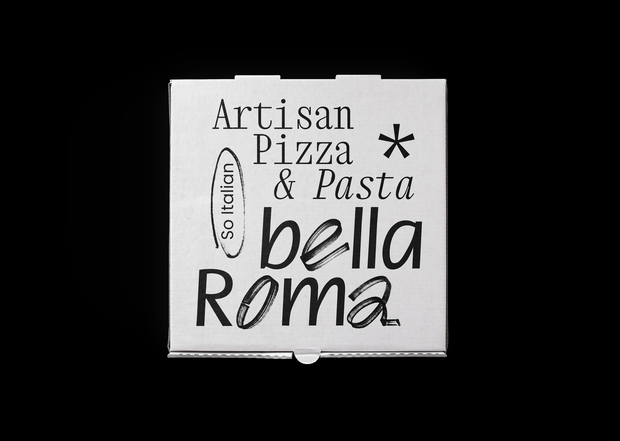
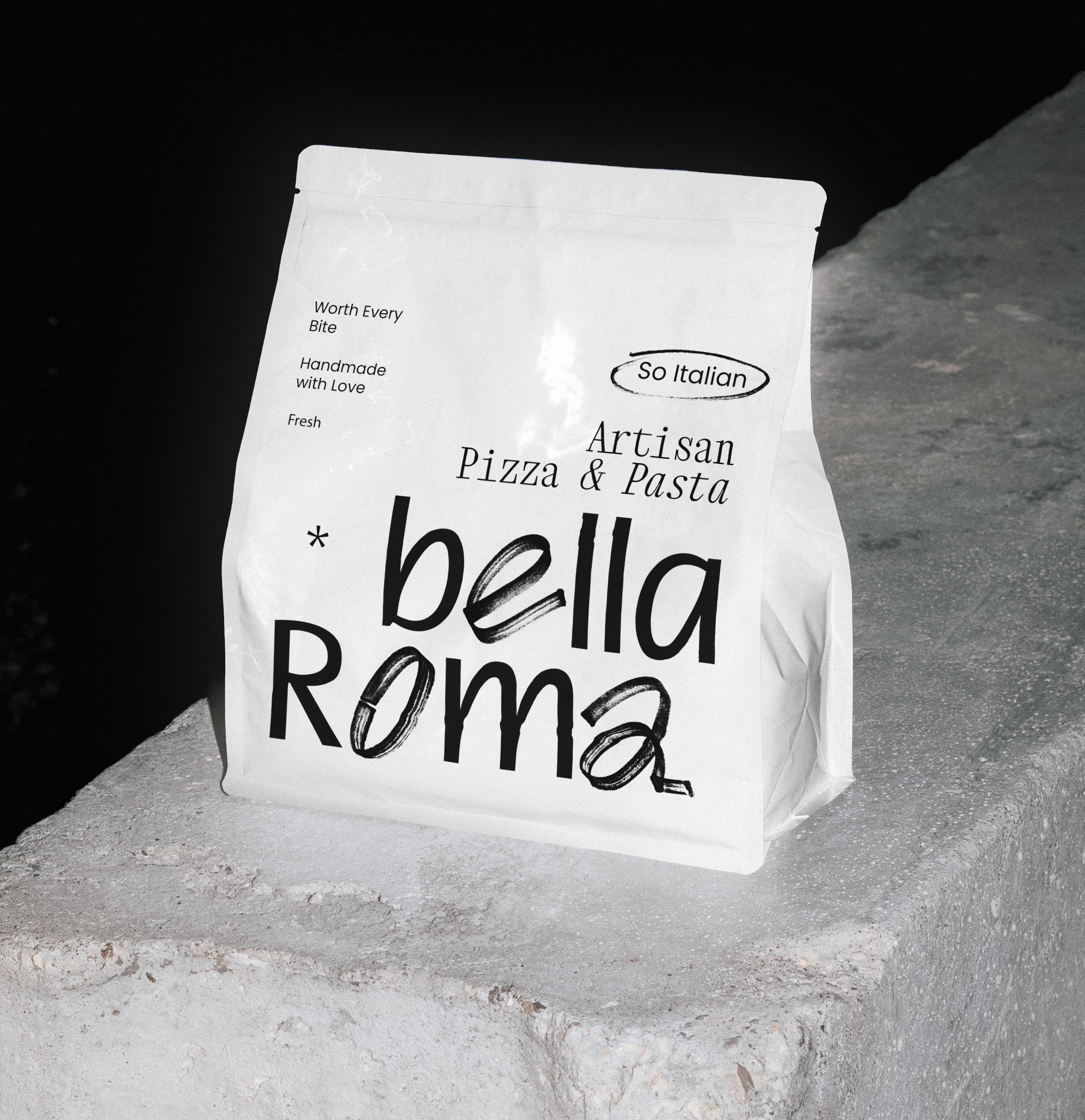
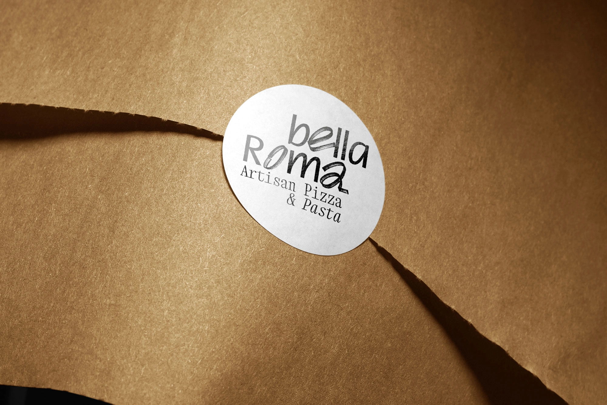
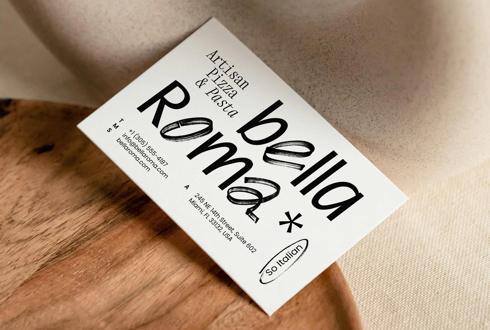
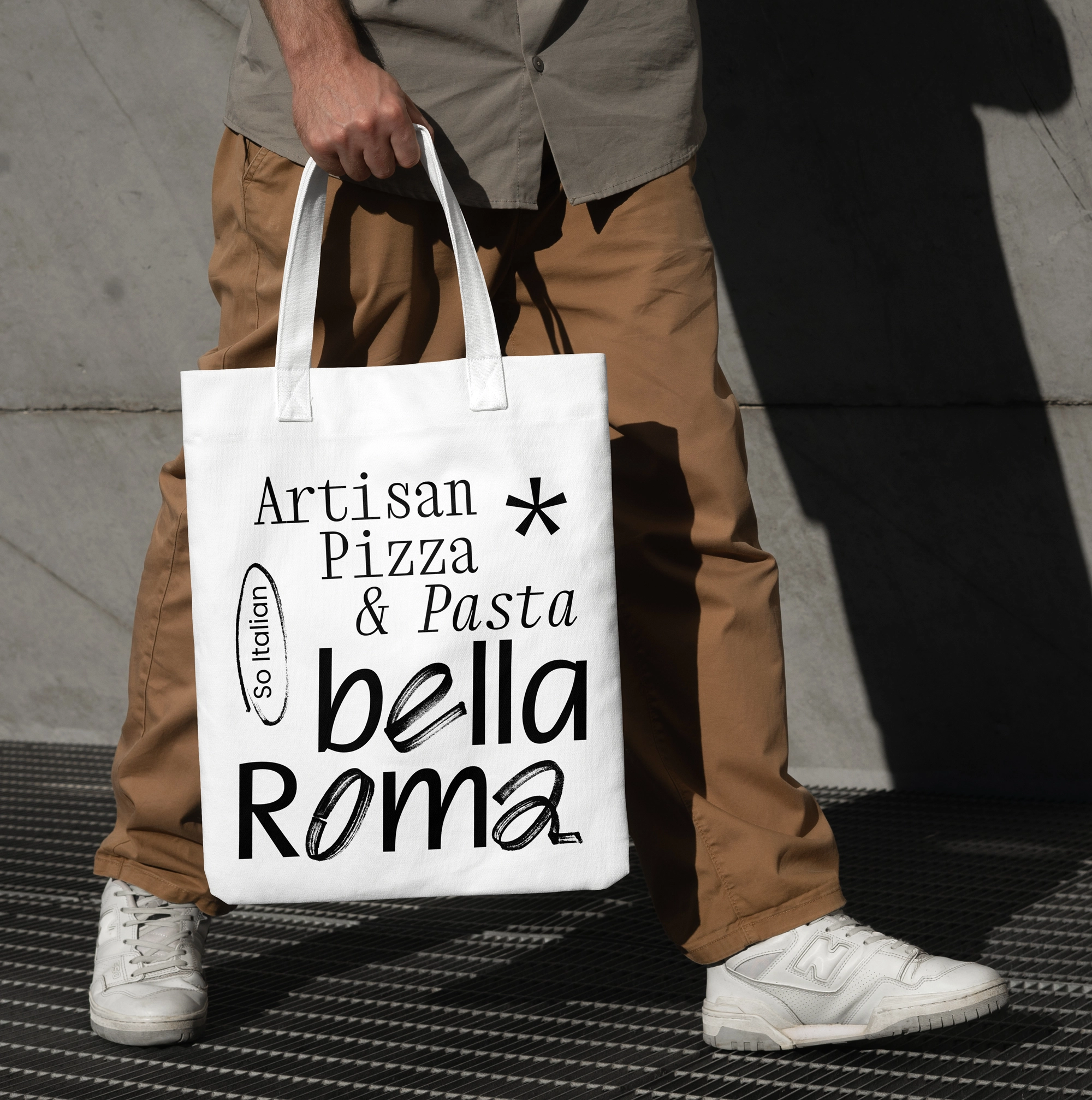
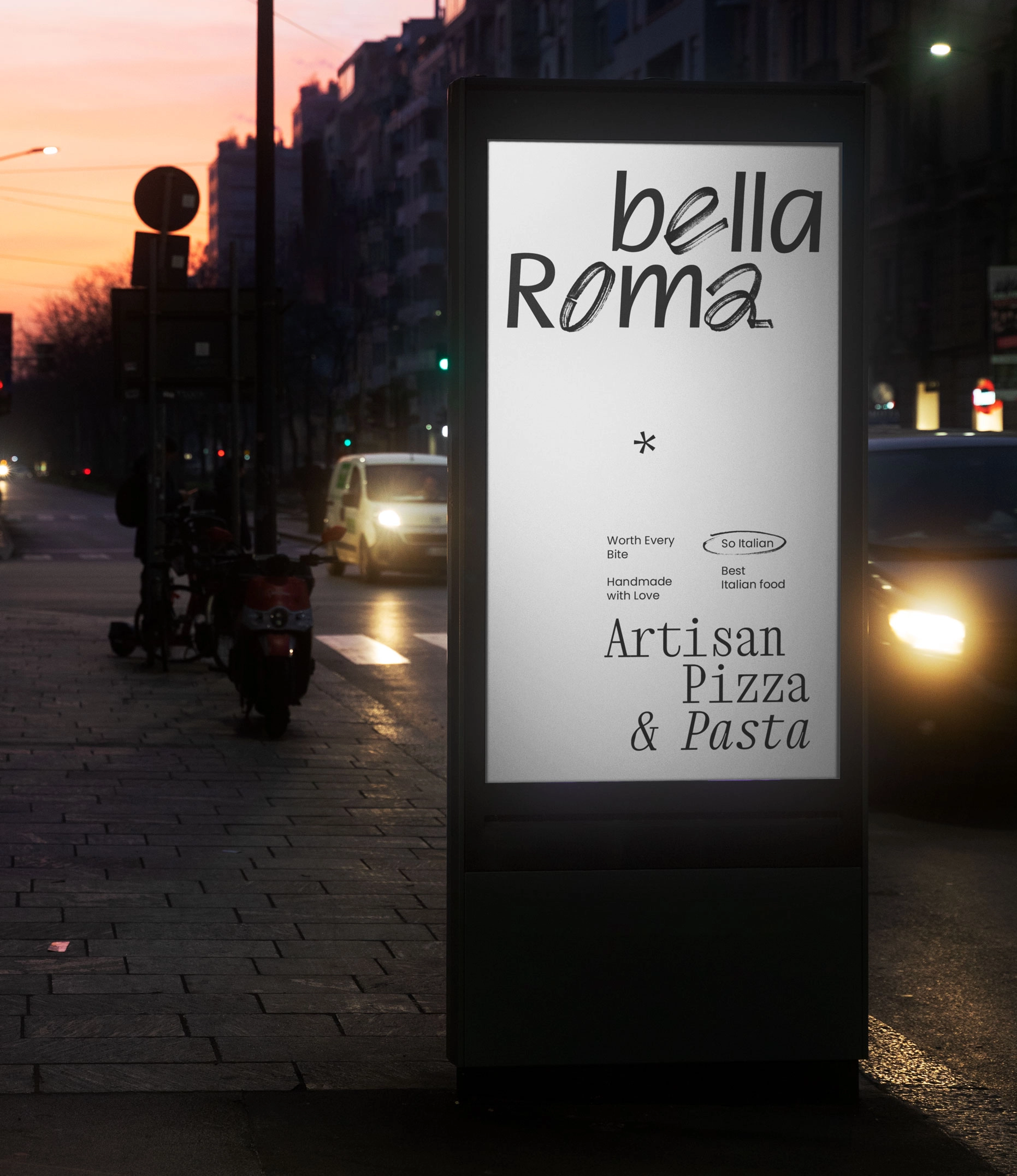
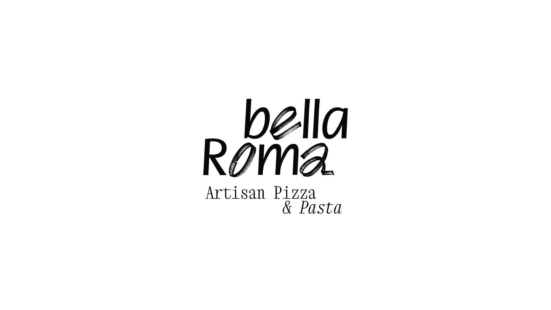
To convey the idea of craftsmanship within the visual identity, we incorporated marker-like textures into the logo. These textures give the identity a more lively, direct, and human character, emphasizing the handmade nature of the preparation process.
At the same time, the structured forms and a certain degree of rigidity in the custom typeface create a sense of stability and trust. This contrast allows the identity to bring together two important qualities: the warmth associated with craftsmanship and the clarity required of a contemporary brand.
The contrast between the marker texture and the clean, precise typography became a defining element of the work. It brought visual expressiveness to the overall concept and became a key signature of the brand’s visual identity.